- 웹개발을 배우기 위해 Udemy에서 the-complete-web-developer-zero-to-mastery를 수강한 내용을 정리하는 포스팅입니다.
- 틀린점이있거나 다른 의견이 있으시다면 언제든지 댓글로 남겨주시면 감사하겠습니다 :)
CSS Grid vs Flexbox vs Bootstrap

-Flexbox는 1차원(column)만 고려해야할때 유용
-CSS는 2차원 (column & row) 을 고려해야할때 유용
CSS Grid
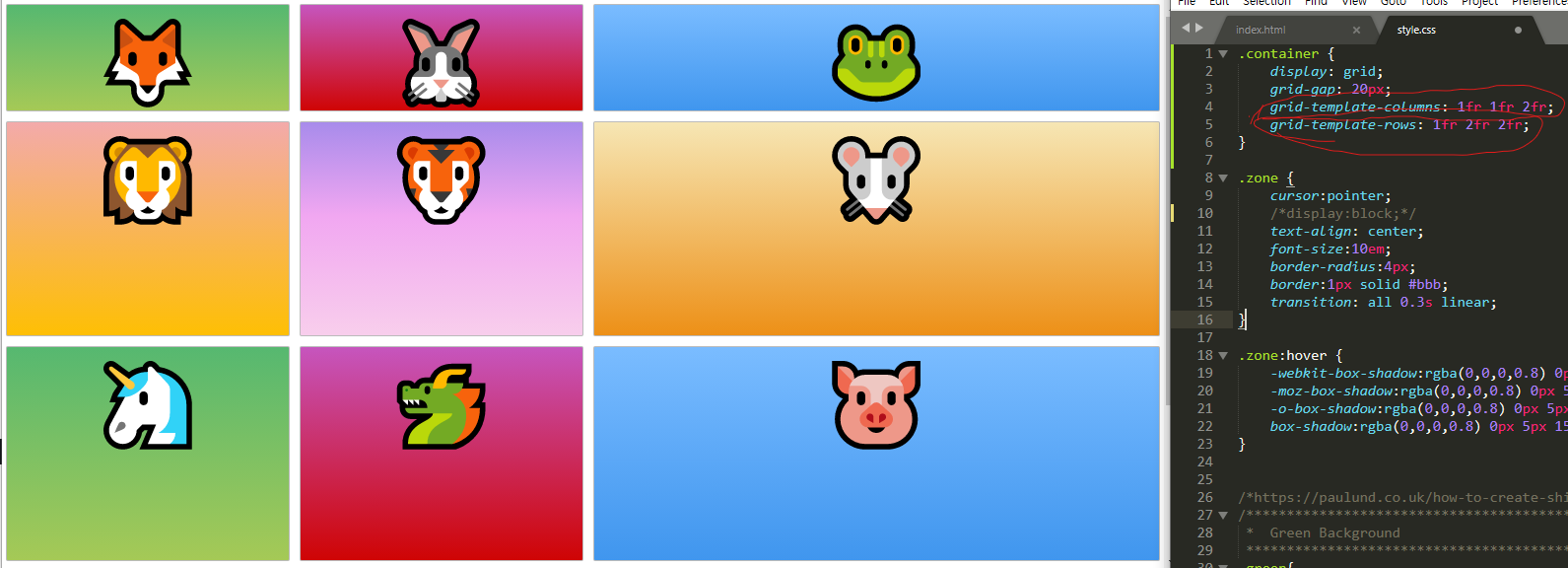
css grid를 사용하는법은 이하와 같다.


특히 grid-template-columns: 1fr 1fr 2fr; 에서 fr은 화면에서 얼마나 fraction을 차지할건지를 정의해준다.
grid는 또한 repeat이 가능하다.

auto 또한 사용이 가능한데 사진으로 내용을 남기기 어려워 링크를 첨부한다.
developer.mozilla.org/en-US/docs/Web/CSS/grid-template-columns
grid-template-columns - CSS: Cascading Style Sheets | MDN
The grid-template-columns CSS property defines the line names and track sizing functions of the grid columns. The source for this interactive example is stored in a GitHub repository. If you'd like to contribute to the interactive examples project, please
developer.mozilla.org
grid-template-columns: repeat(auto-fill, minmax(200px, 1fr)); 를 사용하면 매우 responsive하게 행(Column)을 설정 가능하다.
css-tricks.com/auto-sizing-columns-css-grid-auto-fill-vs-auto-fit/
Auto-Sizing Columns in CSS Grid: `auto-fill` vs `auto-fit` | CSS-Tricks
One of the most powerful and convenient CSS Grid features is that, in addition to explicit column sizing, we have the option to repeat-to-fill columns in
css-tricks.com
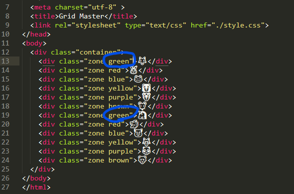
그리드에 있는 특정 아이템을 조작하고 싶다면 해당 아이템의 클래스를 CSS에서 조작하면 된다.

만약 grid-column: span 2; grid-row: 1/2; 부분이 이해가 잘 안간다면 89강 CSS Grid 4 강을 참조하도록 하자.
(grid-column: span 2는 span across 2 grid를 의미한다.)
CSS Grid가 헷갈릴때는 이하의 cheat sheet를 참조하자.
'TIL > The Complete Web Developer in 2021: Zero' 카테고리의 다른 글
| DOM Manipulation(2021-02-09) (0) | 2021.02.09 |
|---|---|
| Javascript(2021-02-08) (0) | 2021.02.08 |
| Bootstrap, Templates (2021-02-06) (0) | 2021.02.06 |
| Advanced CSS(2021-02-05) (0) | 2021.02.05 |
| CSS(2021-02-05) (0) | 2021.02.05 |


댓글